
Page 193 - GIS for Science, Volume 3 Preview
P. 193
Conclusion: Spatial analysis and higher learning
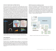
The most important outcome of this introductory spatial data science course is that students could interpret challenges they encountered in data science practice as spatial data science problems and solve them using techniques learned in class. Many topics worth studying remained outside the 10-week course format. Data science programs are still being refined. Because these programs are packed with undergraduate coursework, they often don’t have room to include a dedicated spatial data science track at that level. Nevertheless, many students remained interested in spatial analysis and GIS, and continued their work through independent research or through a senior capstone course that produced remarkable projects. One project created a COVID-19 dashboard showing infection rates by zip codes, which are automatically updated daily from county sources (the list on the left and the central map frame); a forecast of infection rates (right map frame); and a range of socioeconomic, demographic, and health indicators for the selected zip codes (with data from the American Community Survey). The dashboard project won first place in the Urban and Regional Information Systems Association (URISA) 2020 University Student and Young Professional Digital Competition.
A student created this COVID-19 dashboard to show infection rates by zip code, a forecast of infection rates, and socio-economic, demographic, and health indicators.
Acknowledgements
The authors wish to acknowledge the many contributions of the UC San Diego students in the course.
The authors wish to acknowledge the many contributions of the UC San Diego students and tutors in the DSC 170, Spatial Data Science and Applications, in particular Kaushik Ganapathy, Johnny Lei, Eric Yu, Bailey Man, Xiangchen Zhao, Renaldy Herlim, Siddhi Patel, Nathan Roberts, Cameron Shaw, Akshay Bhide, Peter Larcheveque, Jiali Qian, and Songling Lu whose projects are used as examples, and Kaushik Ganapathy, Bailey Man and Miles Labrador for their comments on the draft of this text.
COVID-19 transmission in elementary schools
Another interesting example is a spatially explicit agent-based model of COVID-19 transmission in elementary schools. In this project, students used real school floor plans, digitized with ArcGIS Pro and organized as shapefiles, to simulate viral transmission and accumulation in classrooms and other school areas under various scenarios (learning at individual desks, group activities, recess, lunch, etc.). The simulations helped identify school areas and activities with the highest risk of spreading the virus and demonstrated how a combination of non-pharmaceutical interventions, such as mask wearing, reducing class sizes, moving lunch from the cafeteria to classrooms, adding desktop dividers, staggering attendance, and adding ventilation, could reduce the risk of infection.
Example of a school floor plan used to model COVID-19 transmission.
Teaching Spatial Data Science and Deep Learning 181
