
Page 192 - GIS for Science, Volume 3 Preview
P. 192
FINAL PROJECTS
The self-directed final projects give students a chance to apply any combination of spatial analysis and machine learning techniques to a problem they select and present their work to peers and a group of experts from local government, industry, nonprofits, and UCSD faculty.
Topics may range from detecting wildfires with Moderate Resolution Imaging Spectroradiometer (MODIS) and Visible Infrared Imaging Radiometer Suite (VIIRS) data, predicting habitat change, and analyzing spatial patterns of crime and vehicle traffic, to modeling housing prices and affordable housing strategy, assessing hospital accessibility, and predicting success of sports teams depending on their travel schedules. When students took the course remotely during the pandemic, many projects focused on the coronavirus disease 2019 (COVID-19), including modeling indoor transmission risks, locating testing facilities, predicting infection rates by zip codes, and examining the effects of COVID-19 on home values in various parts of California.
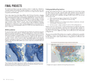
Wildfire prediction
For a project that focused on predicting California wildfires, the student team used exploratory spatial data analysis to identify spatial patterns of historical wildfires. Students then built a machine learning model of wildfire frequency based on several raster layers (rainfall, topography, biomass, etc.), geoenrichment, and identification of “under-serviced” areas that would benefit from additional fire stations and cameras to monitor remote locations. Improving wildfire analysis and evaluating prevention strategies is critical for a state that spends $2.5 billion annually fighting wildfires and where the 2020 wildfire season alone caused more than $12 billion in direct damage.
AB
These images show highest-risk areas for wildfires and under-serviced national forests, with potential locations for additional fire stations in A) Stanislaus National Forest and B) Klamath National Forest and Modoc National Forest.
Finding equitable polling locations
Another interesting student project explored polling stations in San Diego during the 2020 election year and compared them with optimal locations generated through a multistep spatial analysis workflow implemented in a Jupyter notebook using location-allocation capabilities through ArcGIS Python API. The process involved these steps:
1. Filter out precinct polygons categorized as “Vote-by-Mail.”
2. Map current in-person polling stations and removing
duplicate locations.
3. Identify potential areas for polling locations based on land-use codes and
on the number of in-person voters
4. Use these areas to assign candidate locations of the polling stations.
With the centroid of each precinct considered demand points, weighted by the share of in-person voters, the students could then run location-allocation analysis for five regions within San Diego to determine the most equitable polling locations. In many cases, the model’s suggested polling locations differed from the official 2020 polling stations.
This project showed that GIS and data science together could help develop equitable polling place locations, especially when more voters cast ballots by mail and when the the relative shift to mail revealed different voting patterns for different social economic groups.
A fragment of Jupyter notebook with the polling results shown.
180
GIS for Science
