
Page 190 - GIS for Science, Volume 3 Preview
P. 190
Examining food deserts
The US Department of Housing and Urban Development (HUD) designated selected high-poverty communities as Promise Zones. In these areas, government agencies work with local partners to increase economic activity, improve educational opportunities, enhance public health, reduce crime, and otherwise improve community well-being. One such zone is established in southeast San Diego.
The student teams for this mini-project examined whether the Promise Zone in San Diego was also a food desert—an area with limited access to affordable healthy food options. They used the Promise Zone boundaries delineated by HUD, local census tract boundaries and social-economic statistics from the San Diego Association of Governments (SANDAG), and business tax certificate listings from the City of San Diego. The latter included names and North American Industry Classification System (NAICS) codes of various food-related businesses such as grocery stores, restaurants, and fast-food establishments. To create a dataset for regression analysis, students needed to join and aggregate this data by census tracts. While this task appeared initially straightforward, students had to address several caveats. The Promise Zone boundaries, while generally following census track boundaries, were generalized, which rendered results of geometric operations (such as which census tracts are in the Promise Zone) incorrect. Students had to discover and discuss the geometric misalignments and plan to programmatically create the most representative selection of census tracts within and beyond the Promise Zone. An additional source of bias was relying on NAICS codes to identify which businesses provided healthy and unhealthy food options.
As is often the case with real data science projects, regression modeling results (using scikit-learn, a popular machine learning Python library that students are familiar with) predicting ratios of healthy and unhealthy food options by census tracts initially appeared counterintuitive and often inconclusive. They showed a slightly higher ratio of healthy food options in the Promise Zone, because of restaurants clustered mostly elsewhere in the city. This unexpected result made students reconsider the problem formulation and their assumptions, including redefining “healthy” and “unhealthy” food options, re-examining the spatial joins, and considering additional independent variables.
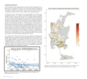
Regression modeling of the ratio of healthy food options versus average income initially appeared counterintuitive.
A snapshot of a map generated in GeoPandas showing a ratio of healthy and un- healthy food options by census tracts, and healthy food business locations.
178 GIS for Science
