
Page 210 - GIS for Science, Volume 3 Preview
P. 210
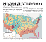
UNDERSTANDING THE PATTERNS OF COVID-19
Clustering and detecting outliers in confirmed cases
Jie Liu, Cheng-Chia Huang, and Xiaodan Zhou, Esri
Data preparation
For each county in the contiguous United States, we acquired the cumulative number of confirmed COVID-19 cases from January 22, 2020, to December 13, 2020, from USAFacts, a not-for-profit provider of policy, economic, and demographic data. We converted the raw data to cumulative cases per 100,000 residents and daily new cases per 100,000 residents. To account for the lack of reporting on weekends in some locations, we calculated the seven-day average of daily new cases and removed the first six days of the original data.
On January 22, 2020, King County, Washington, reported the first confirmed case of coronavirus disease 2019 (COVID-19) in the United States. Since then, several waves of outbreaks have surged across the country. Given the extreme risk to public health, local health departments collect detailed information on the number of confirmed cases, hospitalizations, and recovery rates. Using these data together with ArcGIS Pro, we can explore how the disease spreads in space and time and potentially forecast its future pattern.
 Average time series per cluster
 1
3 early surge mid-early surge
mid-late surge late surge
 2
4
   Figure 1: This map shows four distinct temporal clusters of confirmed COVID cases per 100,000 residents for the contiguous United States from January 28, 2020, to December 12, 2020: 1) early surge, 2) mid-early surge, 3) mid-late surge, and 4) late surge. The inset graph shows confirmed cases per 100,000 residents trending over the same time period.
198 GIS for Science
